Have you ever felt in the dark about a company's financial performance? Maybe you read that GE has debt problems, but what exactly does that look like? Or you've heard that Coca-Cola's sales have been slipping, but to what extent, and for how long?
Today, we're introducing annual and quarterly financial charts to help answer the many questions you have about companies you own or are considering for your portfolio.
Financial metrics aren't naturally easy to interpret, so we put a lot of thought into the best ways to demystify them and help you make more informed investment decisions with your dividend portfolio.
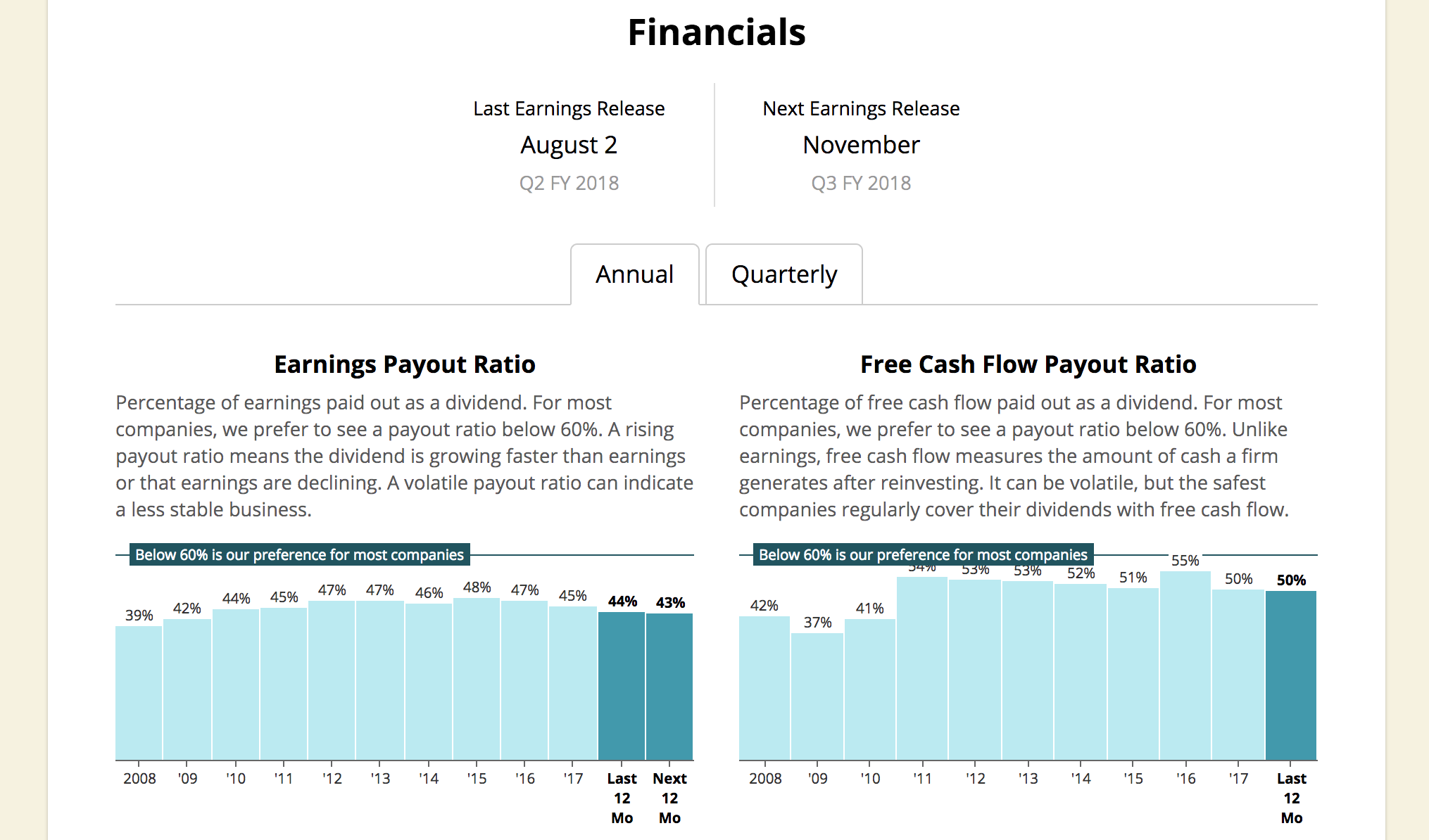
When you pull up a company, you will now find a "Financials" section near the bottom of the page. We brought in charts for over a dozen of the financial metrics we pay attention to the most, covering everything from free cash flow to various debt ratios.
Importantly, each metric comes with an easy-to-understand description and, when appropriate, a benchmark showing the level we prefer to see companies hit.
I really enjoy pulling up my different holdings to see how they stack up. Insights pop off the page. Having this data at my fingertips helps me stay the course by seeing why a business is of high quality, and I also like being able to see the key drivers behind dividend safety and growth.
Here are a few examples...
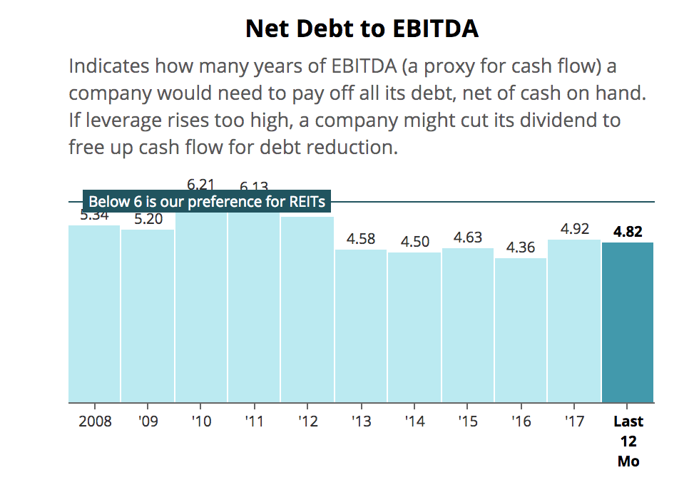
The chart below plots the net debt to EBITDA ratio for National Retail Properties (NNN), a REIT held in our Conservative Retirees portfolio. You can quickly see that not only has NNN's leverage ratio become more conservative over the last decade, but it also remains comfortably below our preferred level of 6 times. It's no surprise that NNN is conservatively managed and enjoys an investment-grade credit rating.
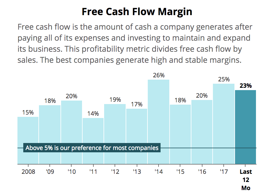
Johnson & Johnson (JNJ) is another holding of ours and has paid higher dividends for over 50 straight years, due in part to its excellent free cash flow generation. You can see that the firm's free cash flow margin has towered above our preferred 5% level for more than a decade, demonstrating its ability to churn out cash like few other businesses can.
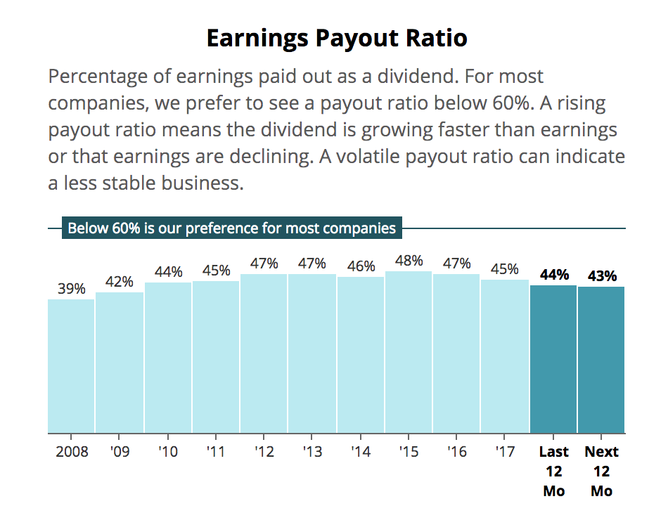
We can also see that J&J's payout ratio remains nicely below our preferred level of 60% for most corporations, providing management with flexibility to continue using the firm's free cash flow to grow the dividend at a healthy pace. These are reasons why J&J remains a fundamentally solid dividend growth stock.
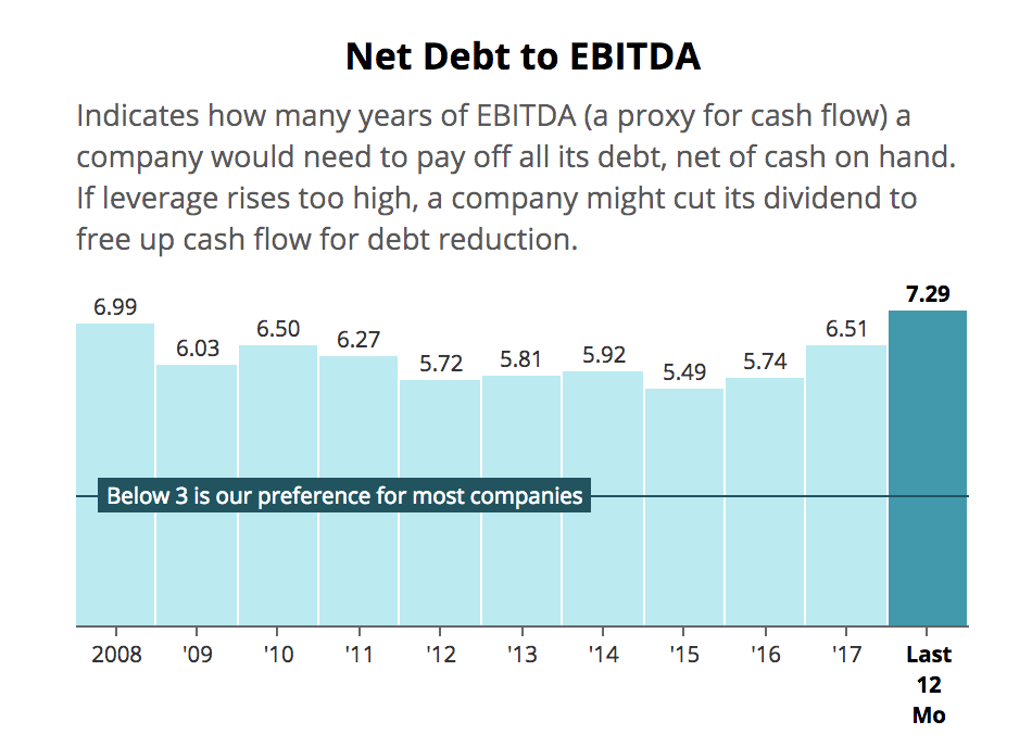
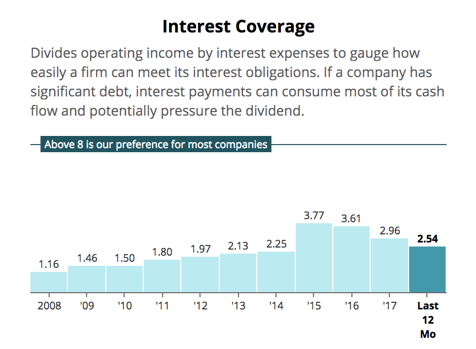
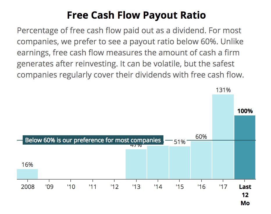
But what about risky companies that conservative investors should probably avoid? Charts and our benchmarks help them stand out quickly, too. Take Dine Brands Global (DIN), for example.
The owner of the Applebee's and IHOP restaurant chains cut its dividend by 35% in February 2018. Looking at the charts, you would have seen a business with a very strained balance sheet (net debt to EBITDA and interest coverage ratios well beyond our preferred levels).
Meanwhile, Dine Brands Global's free cash flow was under pressure as its restaurants struggled, pushing its payout ratio well above a sustainable level. When combined with its high debt levels, this was a clear warning that a dividend cut was likely.
I encourage you to take some time exploring our new financial charts. We've done our best to take the intimidation factor out of financial analysis, keep you focused on what really matters, and hopefully help you maintain an even safer dividend portfolio.